GA 101: A UX designer’s guide to Google Analytics
Sumanth Avn /
UX design is an iterative process involving multiple stages and a wide array of toolkits. Every stage in the design process involves various steps, and each step requires certain tools. All of these tools play a specific role in the design process. For many people involved in UX design, it is likely that they picked up Photoshop or Illustrator as their primary tool for as long as they can remember. It was Sketch App that was a breakthrough in this system, and many designers at the time switched. I was comfortable with Photoshop and put Sketch on the backburner for almost a year. Looking back, I realize it was wrong of me not to give Sketch a spin earlier.
I was determined from that day that if I ever come across a tool that was designed to fit into the UX Design process that seemed promising, I will definitely try. Since then, I have tried different tools ranging from Axure to XD and everything in between. One tool that I do not often see on a designer’s stack is Google Analytics.

We lean towards qualitative research and believe that someone from the Product or Business team will help us with the quantitative data. However, if you can marry qualitative research with quants, you can find patterns by funneling and arriving at an informed decision. You can also use data to measure the impact of your designs. I think there is no better feeling for a designer to know that their design works!
You need not worry if you were not good at Maths or Science in school. Just like Photoshop, Google Analytics is also a complex tool. Marketing professionals and SEO Experts extensively use Google Analytics. But this powerful tool doesn’t have to be limited to analyzing your web traffic; it can become a pivotal tool in your arsenal. Below are some of the ways in which you, as a designer, can leverage Google Analytics.
User Demographics
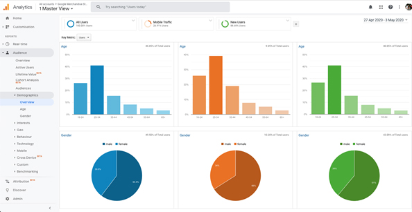
Know thy audience. This is crucial to the existence and operations of almost every service, and UX Design is no exception. Who’s your target audience? This is one of the classic questions that we always rely on to base a design strategy. Situations where clients have mentioned “Everyone” is more common than one would expect, and it’s not their fault either. Clients are highly optimistic and hope for a design solution that would work for as many types of users as possible. Reality is not that simple though and a blanket, one-size-fits-all solution rarely ever works without some additional research.
That is the time when someone can simply sign-in to Google Analytics and find valuable information about Age, Gender, and Location. It can also provide other insights like most commonly used resolutions, devices, interests, etc. The high-level overview and detailed drill down into the demographics data can help you assess your design strategy and cater to the audience accordingly.

User Behaviour
The next thing you’d most likely be interested in knowing is what they’re doing on your application once you know who your audiences are. The goal is to make user journeys smooth and effortless.
Google Analytics provides a powerful way to analyze this information visually through a Behaviour Flow report. This allows you to track down your different pages and how users navigate through them and interact. It can help you understand the patterns in user journeys, see the most common routes users take and also the most common exit pages where the flow ceases.

Navigation
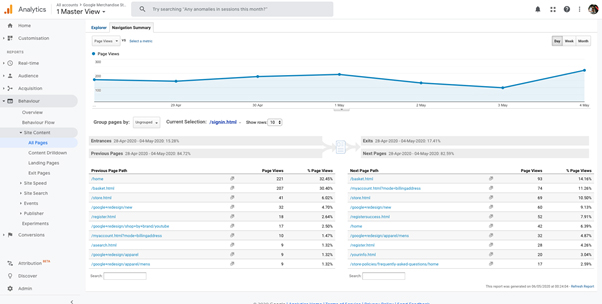
The user behaviour flows mentioned above do a great job of summarizing and visualizing the flow of users on your website on the most common paths. The one drawback with it is that it doesn’t go into the details of every page, and if you want that information, it’s where the Navigation Summary report comes into play.
Navigation Summary report goes into the details of all the pages on your website and looks at the chain of events immediately preceding or succeeding the page of your interest. This is a great way for you to understand how people land on a particular page and what pages they end up moving on to from the current page.

Engagement
While it’s good to visualize the user flow on your webpages and look deeper into the pages of your particular interest, it’s also helpful to look at the key metrics that can make up the engagement factor. These metrics are quantitative indicators of user engagement on your pages of interest and the website as a whole. This is usually considered to be something left alone for marketing and campaign analysts, but it is definitely a UX designer should be well aware. Some of these metrics, like Pageviews, Time on site, Bounce rate, etc., are the most common ones.
Bounce rate can be a double-edged sword where a higher bounce rate can mean that either the user has left the page quickly because they found the information they’re looking for or that the page they landed on was irrelevant. Then there are some more jargons that had me confused for a long time. Exit Rate and Bounce Rate are explained here in detail. Metrics like these allow us to quantify user engagement on your pages and see if there’s room for improvement in specific pages.

Events
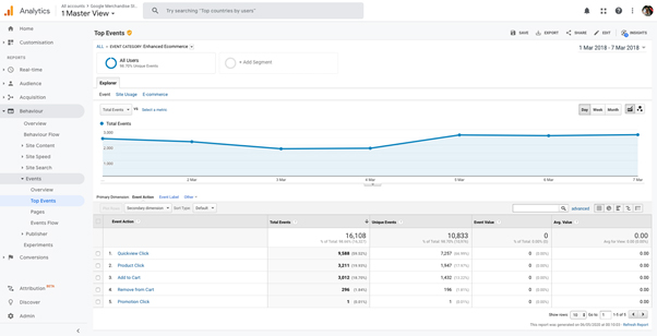
As mentioned briefly before, Google Analytics allows you to track individual interactions from a page-level and website-level. This is what the Events section in Google Analytics focuses on primarily. It allows you to set up custom, event-level tracking on links and CTAs that you care the most.
If you are unsure whether your design is facilitating conversions on the pages or not, the Events monitoring summary is a tool exactly made for that. In addition to metrics for Events, Google Analytics also allows for visualizing Event Flows, which is similar to the User Behaviour flows mentioned earlier.

Dashboard
Google Analytics has a plethora of things that are more targeted towards the power users to reap the most out of it. As a designer, only a few things mentioned above are relevant to us and the design process. The dashboard allows you to pick those sections so that you can quickly jump to the information that matters the most.

Conclusion
Some might argue that trying to learn many tools can make you a generalist, not a specialist. I would say there is no harm in trying to learn or explore new tools in your downtime. Some of the things that one should take care of to save themselves from getting lost in data are:
- “Analysis Paralysis” syndrome: You shouldn’t get caught up collecting the insights so much that you forget the objective of building an amazing experience for the users.
- Numbers tell you the what but not the why: Data has the power to differentiate between what is working and what is not. However, Qualitative research will find you the answers for why. Quantitative analysis can never be a substitute for qualitative research.
- Bias is in the eye of the beholder: There is a possibility for bias to creep in qualitative research. It would be criminal to gather data just to prove it right.
Now that you are ready to jump into numbers and graphs, Google has a demo account that everyone can access and explore the possibilities of this tool. Give it a try here https://analytics.google.com/analytics/web/demoAccount and see for yourself as to how much value this can add to your design.
References:
- http://www.ericmobley.net/an-introduction-to-google-analytics-as-a-user-experience-research-tool/
- https://jetpack.com/2018/06/25/user-experience-website-analytics/
- https://uxdesign.cc/google-analytics-ux-alice-emma-walker-958d6f0f0af3
- https://www.creativebloq.com/ux/improve-your-ux-google-analytics-31619685
- https://uxdesign.cc/7-google-analytics-metrics-that-help-in-optimizing-website-ux-for-higher-conversions-7e9309eb6516
- https://speckyboy.com/google-analytics-tips-ux/
- https://www.designernews.co/stories/89310-google-analytics-for-uiux-designer
- https://dashthis.com/blog/improve-ux-design-by-looking-at-google-analytics-metrics/
- https://www.nngroup.com/articles/analytics-user-experience/
- https://userbrain.net/blog/5-ways-track-optimize-user-experience-google-analytics
- https://www.forbes.com/sites/pauleannareid/2020/05/13/meet-the-woman-who-breaks-down-insights–data-for-the-worlds-top-brands/#136691571e53


