The Fall of Lorem IpsumAnd the Rise of UX Writing
Kriti Krishan and Noella Dias /
“Writing is easy. All you have to do is cross out the wrong words.” – Mark Twain
Today, the anatomy of a digital experience includes images, shapes and words. These three are the equivalent of the 7 musical notes which can be combined in infinte number of permutations & combinations to craft a musical or digital experience. In the nascent stages of the UX industry, a UX designer was largely responsible for the ‘Shapes’ only. Shapes essentially relate to the navigation, interaction & layout elements of a digital interface such as tabs, cards, links, buttons, etc. Images and words were other people’s responsibility which was an extremely siloed and fragmented way of approaching UX design.
Experience is a seamless amalgamation of all three elements working together as a harmonious whole to create a desired feeling. As the UX industry matured, the UX designers role evolved as a result of this need for a more holistic approach to experience design.
Move over Navigation… Content is the New King.
Navigation used to be the most important pillar of UX design but it has gradually become less and less important. Navigation in the traditional sense means moving between screens. However, users today are not really moving between screens. Are they? Think about your content consumption behaviour on mobile phones… facebook for example…what percentage of using facebook involves ‘navigation’. You open the app and then basically just scroll. Mobile interfaces and the need to keep users hooked have ensured that infinite scrolls have replaced traditional navigation elements such as tabs, links, buttons, etc.
With Navigation out of the way, Content has emerged as the differentiator. If finding content is just as easy everywhere, what creates real digital differentiation today how the content is written.
What all does ‘content’ include on a digital interface…?
Below are a few examples/areas where words can play an important role —
CTAs
Call-to-action microcopy helps the user understand what to expect next on click of the button. Hence, it needs to be simple, direct yet powerful to grab the user’s attention and lead them right to the action. Use a minimum number of words to make an effective call-to-action.

Instructional Text
Users have things they want to accomplish on your site. We often write instructions to assist users in knowing what to do next. Good instructions will guide users, even if their mental models are imprecise or erroneous.
It’s good to add a little personality to your instructions, it helps users have a pleasant or humorous experience. For example, the instructional text below makes the user feel better instead of a failure for forgetting a password.

Onboarding
This is where your app/website creates a first impression onto your users. It’s important to keep your copy crisp and clear to effectively communicate about the app in simple steps. Make sure you don’t overload your onboarding screens with too much text.

Headers
Headers help deliver and emphasize the key message on a page. Powerful headers are catchy and short to quickly draw user’s attention. Research states that the perfect length of the headline is 6 words.
In the bottom example, the header is a question to the clickable cards. Keeping it conversational too helps the user connect better with your product.

Error States
When a particular action goes wrong, it is vital to provide instructions and guide the user on how to correct it.
A lot of errors occur when there’s a form to fill out, so it’s a standard practice to have a micro copy underneath the field along with a general message about an error happening. Pay attention to your tone of voice. No one likes to be told they did something wrong, so make sure to keep things light.

Forms
No one likes to fill long forms and so hand-holding the user wherever required is crucial here. This helps ease up the process and avoid any unnecessary mistakes.
If you encounter a place on your form where users might go astray, make a mistake or feel unsecure — don’t hesitate to put a short text to help the user in the process.

10 Keys to Effective UX Writing
“Every design challenge is a communication failure.” – Saurabh Gupta, ZEUX Innovation
Think about UX writing as a conversation with your users. It helps them take the right action, answers their questions, and gives them feedback. Speaking your user’s language by providing them with informative, useful and entertaining content can ensure a better user experience. Let’s look at these 10 simple things to keep in mind while writing for UX the next time.
1. Mantra: Clear, Concise, Useful
Clear
How do you translate what’s happening on your back-end to the other side of your screen? How do you make your software sound human?
For clarity, remove the technical terms and put the action in the context of the user. Jargon free messaging offers context.
Concise
Concise doesn’t only mean short, it means something closer to efficient. While writing concisely, look at your message and make sure every word on the screen has a distinct job.
We don’t read every word on the screen, we scan.
So, we keep our text not only concise but also frontloaded. Putting important words first so people’s eyes catch those important words as they skim-read.
Like in the below example, keep the most important text up front and then ruthlessly edit what comes after it.

Useful
The CTA (call-to-action) guides people in their next step. It’s important to have actionable items which informs the user (in this case) get where they want to go. And so the call to action needs to be in line with what people want to do.
Here, ‘OK’ is not a good call to action. ‘Try again’ & ‘recover password’ instead work better as it gives the user an option to either try again or just recover password if forgotten.

These 3 principles don’t always work in harmony. There’s a kind of tension in between them. Keeping your users context in mind will help find the right balance between these 3 principles.
2. Pay Attention To Brand Voice
Paying attention to writing along with the people you’re writing for is very crucial. The digital experience should be in sync with the message and positioning of the brand to make sure that it is consistent and clear throughout. Both of these below statements work fine depending on the ‘tone of voice’ or character of your product.

3. Be Consistent
Inconsistencies in people’s words reduce trust. Wouldn’t you be on guard if someone kept changing what they say? Similarly, it is important to be consistent with terminology in the UX of a product.

4. Humanize Your Product
UX Writing serves as a conversation with users. When you converse with someone, it humanizes them. It makes them personable, relatable.
Therefore, when you talk to your users, it humanizes your product. Software companies improve their likeability by employing conversational elements, known to reduce the perceived coldness of the interface.

5. Guide The User
Every one of us has experienced frustration while setting passwords. Meeting the requirements for password strength is always an ordeal. MailChimp handles this well as it lists out the requirements as bullet points – and deactivates the ones that have already been accomplished by the password. This makes it easier on the user to know what to modify to get through the flow easily, and of course increases overall conversions for the product.

6. Set Expectations
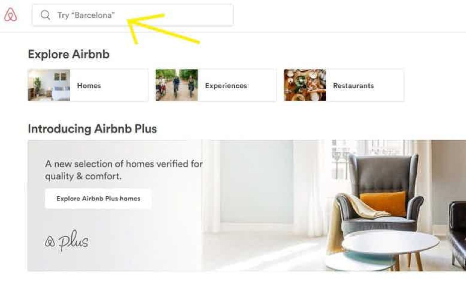
When a user is interacting with a field, she likes to know what that field can offer her. In this example from Airbnb, the field prompts you with what you should search for – which tells the user what the best way to find and explore for homes would be.
7. Increase Trust
Many a times, our privacy feels invaded by long forms that ask for a lot of information we don’t think they need. Clarifying why certain fields are required by the company is a good way to address a user’s reservations and increase overall trust in the brand.

8. Increase Clicks
CTAs survive on clicks. A CTA without clicks is ineffective and unnecessary. The words on a CTA define whether the user will click on it or not.
In this example, the CTA “Request Pricing” uses the language of the user. A user looking to find out a list of prices and not to give details before understanding the range is more likely to click on “Request Pricing”, as “Request a Quote” is vague and also implies a kind of call-back system or a personalized journey (which is not the quick look the user might want right off the bat).

9. Make People Smile
Humor is a big part of good conversation. Delightful UX writing can make boring and annoying parts of the journey more pleasant – like 404 pages and long product descriptions.

10. Practice
Last but not least, practice is the best way to get good at something. A good resource is the 15-day mail challenge by www.dailyuxwriting.com.
Words are the New Secret Weapon in a UX Designer’s Arsenal
UX writing follows the Pareto Principle. 20% of your effort can lead to an 80% increase in output – in this case an exeperience as close to perfection as possible. Being mindful of these aspects that surround the visuals of UX design can take an experience to that next level.
At the end of the day, Unicorns do exist in our world – and you can be one. It’s important to understand that words contain just as much design ethic as a wireframe. With an emphasis on visual design — fewer words and crafting the right words has become even more important.
References:
- https://www.invisionapp.com/inside-design/ux-writer/
- https://uxplanet.org/ux-writing-how-to-do-it-like-google-with-this-powerful-checklist-e263cc37f5f1