A Millennial’s Guide To Designing For Millennials
Fatema Khalil /
Some of you are probably done up to here with all this talk about ‘Millennials’. And truth be told, so am I. There was a time when UX designers would battle it out with clients to get them to focus more on customer segments and target user groups. You’d think we’d be jumping with joy for all this buzz around Gen Y, right? Not so much.
Millennials have received so much focus recently, it’s as though the other generations ceased to exist. In fact, there’s so much conjecture around millennials they’ve almost taken on a mystic quality, as if they come from another planet.

So, what’s all the fuss about?
Millennials are a generation apart in the sense that they grew up alongside the communications technology. They are what we call ‘digital natives’, raised in a digital, media-saturated world that has affected their behaviour in some respects.
This makes it critical that UX design companies correctly understand who a millennial is, instead of chasing after some mythical imp that has terrible work ethics and would give Narcissus a run for his money.
Born this way
According to you, what defines a millennial? A person born
- between 1980 to 2000s,
- mid 1990s to early 2000s,
- between 1985 to 1996, or
- in 1980s or 1990s?
Not sure? Nor, it seems, is the rest of the world…
- Between 1980 to 2000s – NN Group
- mid 1990s to early 2000s – Wikipedia
- between 1985 to 1996 – New York Times
- in 1980s or 1990s – Merriam-Webster Dictionary
The most popular definition is from 1980s to 2000s, as suggested by NN Group. Most other definitions tend to fall under this range.
Millennials are a generation or cohort that is defined by the growth of social technology.
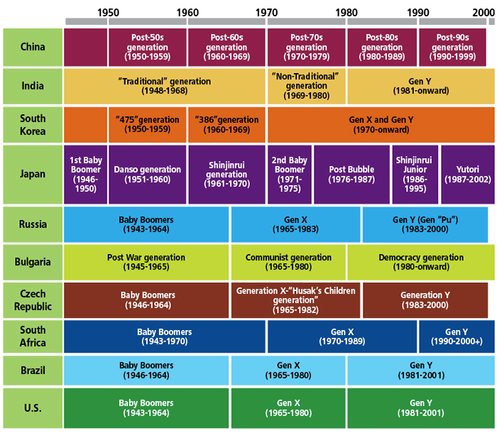
Of course, generations would be defined differently in different geographical locations, represented in the image, and we cannot stamp on a blanket definition adopting one model for all. That said, for lack of a better framework, we’ll be using a more western influenced but heavily researched definition of millennials for this article, since evidence suggests that at least in terms of digital spaces there is an overlap in user behaviour across geographies.
So apart from when they were born, what other traits differentiate a millennial from the rest?

Maddy was born in the year 1989. He likes easy interactions, straightforward content, and an enjoyable experience. He tends to multitask more than his parents ever did, though it seems he’s no better at it than them. He’s constantly connected with his social circle through his various social media accounts. Maddy and his friends make regular updates to Facebook, Instagram, Snapchat, Twitter, you name it, their posts often referring to global events and reflecting their eagerness to affect change.
Maddy tends to be more impatient, with a higher need for immediate response and gratification than his parents’ generation.
Here are a few more interesting nuggets of information about Maddy and the Millennials that will help you design a more effective experience for them.
Ain’t nobody got time for that
Fact: User attention span is now 8 secs
The millennial user today has a very short attention span, even shorter than…wait for it…the gold fish. That’s right, what once was a short window to grab your user’s attention, i.e. 12 secs, is shrinking; until one day interfaces will need to be a completely invisible part of a user’s ecosystem, requiring 0 voluntary feedback from them to complete any given task.

A contributing factor here is that millennials are choosier about where to dedicate their attention and time. Every moment they spend on your interface, they could be spending on another, potentially better one. If an interface is not able to engage them immediately, they will seek that engagement elsewhere.
What does this mean for designers?
Interface designs should quickly communicate their value proposition to customers, using visual cues wherever possible. Flows must be clutter-free and lack friction points. Content must to be succinct, relevant, personalized and meaningful. Use of engaging interactive elements that help your design stand out from the rest is crucial.
Also, keep it simple. There is a tendency in the business world to offer products that are very feature heavy, with multiple options for users. Millennials have no patience for this attitude. More options mean more time to make decisions. They want the interface to do the work for them. So, get to know your users and only offer them options or features that they need.
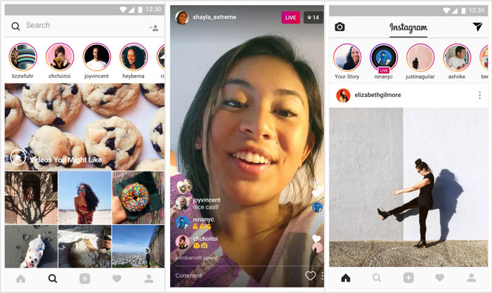
Instagram provides a platform for users to tell visual stories through static images and short videos. The design is simple, with few features which fit perfectly into the app’s overall strategy.
A Generation Of Sceptics
Fact: Millennials are much more sceptical of the information presented on websites. They demand evidence to support the claims made.

Millennials are a generation who have grown up in an era of false news and tall claims by companies trying to sell their products at any cost. As such, they have turned into a jaded lot who question everything they see or hear.
What does this mean for designers?
Reassure your users as explicitly as possible, with the use of various trust markers. Create trust for your brand by displaying reviews or recommendations for your product/service by industry experts. Testimonials and customers reviews also go a long way, though users have begun to take them with a pinch of salt since many companies have been known to buy or plant positive reviews.
Online shoppers find it easier to trust products when sellers provide detailed information of that product, along with high quality images. Adding badges like ‘Verisign Trusted’ and ‘Help’ options, especially on payment gateways, go a long way to build trust.
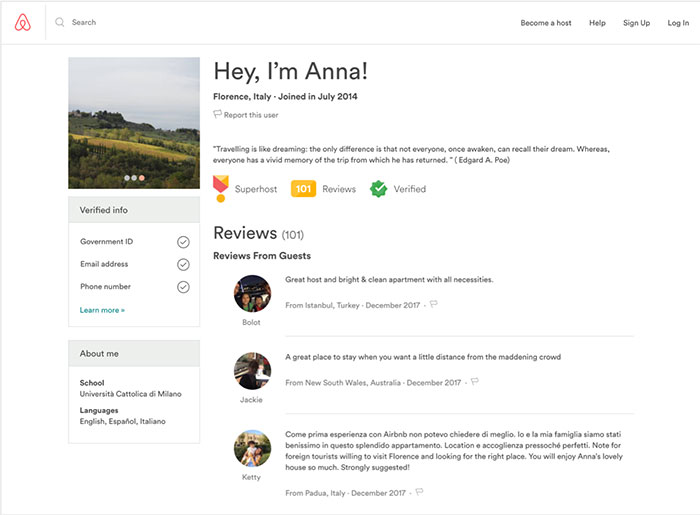
Airbnb adopts a host of these techniques to build trust for a business module where trust comes at a premium. Users can read reviews of the rental space and the owner/manager of that space. Home owners can read reviews of potential guests too, before accepting requests to rent.
Smart But Sloppy
Fact: Millennials tend to be extremely confident in their own ability to navigate digital interfaces, even when encountering radically new design patterns. As a consequence of their confidence, they are error prone when using interfaces. They often click first and ask questions later.
Millennials have a growing confidence in a design’s ability to be so intuitive that they don’t have to think about what they’re doing while doing it. The interface will handle it. If an interface cannot, in fact, handle it, millennials are quick to drop them and go find someone who will.
They expect tasks to flow in a certain matter, either because of previous experience (other websites) or an established mental model about completing a task. Being forced to do things differently increases the cognitive load, creating a learning curve, which consequently results in slowing them down and making them more prone to errors.
What does this mean for designers?
There are two parts to dealing with this behaviour or expectation:
Design interfaces that are intuitive
Design flows that match the expectations of your users. Anticipate your users’ mistakes and design solutions to manage them by offering options to undo actions. It may even mean adding friction rather than reducing it, for e.g. requesting an express confirmation before completing an irreversible action (e.g. deleting all files from your Trash folder).
A famous example of bad design that would have benefited from added friction is the case of the False missile alert sent to the citizens of Hawaii in January this year.


In this scenario, friction added to the design on purpose, either demanding further authentication (e.g. a special code), or authentication by multiple people, could have prevented this embarrassing mistake.
We UX designers sometimes get carried away in the name of innovation and end up breaking what those before us have painstakingly built. Your users expect your products to work in the common, most familiar way possible and consistency is key to that experience. So, balance freshness with familiarity. Give users a taste of the new in an environment they are used to. Rather than trying to break a habit, see how you can leverage it in a newer, more exciting manner.
Uber ran a campaign to celebrate PV Sindhu becoming the ‘first Indian woman to win a silver in the Olympics’ by turning all the cabs on its app into shuttlecocks.

Be The Change
Fact:Millennials have a higher degree of social awareness.
Greater exposure to global events through social media platforms like Twitter and Facebook has made millennials more aware of the world around them. By sharing their opinions on various issues and adding their voice to social campaigns (e.g. #MeToo), millennials have accepted greater accountability for the actions of society. They want to make a difference and are keen to support establishments who allow them to do so.
What does this mean for designers?
Design solutions that allow your users to feel like they’re part of a cause which can provoke positive change. Give them an avenue to communicate and present their views.
Tailor your content to reflect your product’s positive impact on the world by highlighting facts like the philanthropic work undertaken using profits earned from users, ethical sourcing and disposing of materials, etc.
Your users will begin to associate the sensation of pride, that comes from making a difference, with your brand/ interface/ product and this in turn will build their sense of loyalty to your brand.
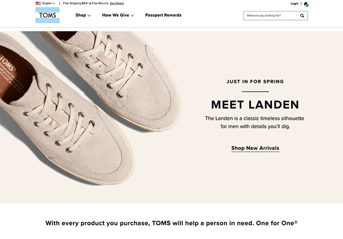
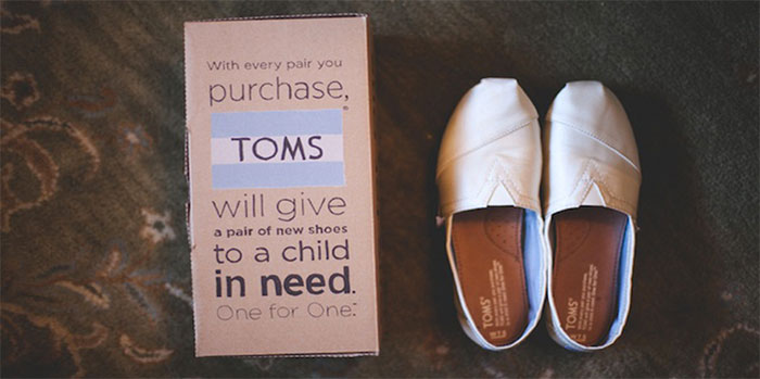
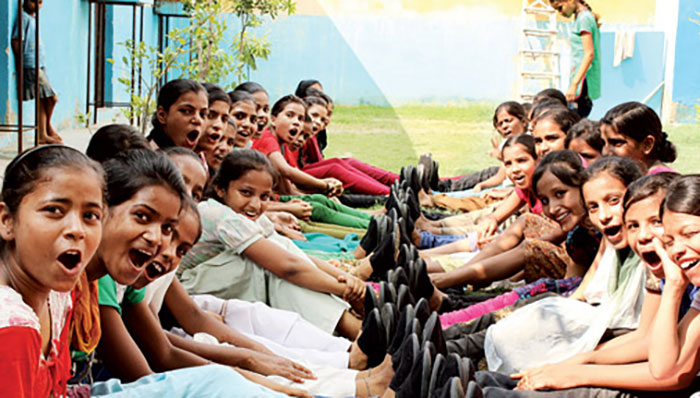
Toms, the shoe company, started an initiative where for every pair of Toms a customer purchases the company will donate a pair of shoes to those in need. Their official site title is TOMS® Official Site | The One for One® Company. They carry this messaging forward on the landing page of the site, as well as in the packaging of the shoes
Seamless is more
Fact: Often users don’t complete an activity in one sitting or through a single channel.
Millennials are constantly connected. Be it from their laptops at work or from their smartphones elsewhere (on the train, in bed, even in the loo). This gives designers multiple opportunities to engage users. It also means that every time a user moves from one device to another the interface of the relevant device needs to allow the user to transition as seamlessly as possible.
Device inertia is a term that describes an interesting tendency we all exhibit as users of multiple devices. It is a tendency to stick to the device that we start a task from (E.g. researching a topic for a project on the phone), in spite of knowing that the task may be better performed on another device (e.g. laptop).
These behaviours may seem contradictory but it’s a case of lack of motivation vs. compulsion. A person sitting in bed watching movies on the laptop will login to a pizza delivery website to order a pizza even if their phone has an app with all the details already filled in and no login required. On the other hand, a person on a train commuting home from work cannot continue browsing valentines date ideas from their laptop so they must switch to their phone.
What does this mean for designers?
Build experiences that are continuous, consistent and optimised.
Continuous design allows users to continue tasks from any given device, e.g. resume watching a video on the phone from where they left off on the laptop.
Consistent design goes without saying. Adopting consistency in design across devices reduces the learning curve for users, allowing them to move from device to device without a hitch.
Optimised experiences are a result of understanding a user’s behaviour, habits and ecosystem when using each device and creating designs which align with the same. A simple example is the way a website’s navigation moves from the top of the screen on laptops and tablets to the bottom on phones, making it easier to reach.
Gone are the days when companies could get away with claims that they provide an omnichannel experience just because their site is ‘responsive’. Companies without a robust omnichannel strategy that truly caters to the users’ needs of seamless and consistent experience are likely to come across as uncaring about their users. A costly oversight.
In an ideal scenario, a good Omni-channel experience would allow a user to walk into a Zara store and get a notification on their phone, “The jacket you have added to your online cart is available at this store, in your size and colour of choice”. It would also point the user to which part of that store the jackets are kept, “You can try on this jacket, and if you don’t like it here are some more recommendations from this store, based on what we know about your style”
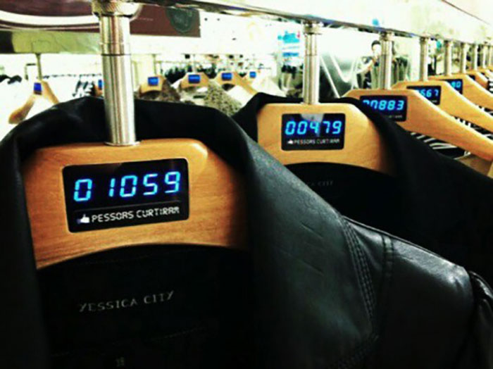
Special clothes hangers at a Brazilian store show the number of Facebook likes each item has.
And that’s the scoop folks!
If you want Maddy’s attention and loyalty, make sure your interface
- is visual, friction-free and personalised
- builds your users’ trust
- manages user errors through intuitive and consistent design
- empowers your users to affect change
- implements a robust omnichannel strategy
The beauty of this list is it lends itself to a better experience for the other generations too, and I bet Maddy’s dad will appreciate the effort.
References
- Nielson & Norman Group
- Forbes
- https://www.telegraph.co.uk/science/2016/03/12/humans-have-shorter-attention-span-than-goldfish-thanks-to-smart/
- https://www.scribd.com/document/265348695/Microsoft-Attention-Spans-Research-Report
- https://www.nngroup.com/articles/young-adults-ux/?lm=millennials-digital-natives&pt=article
- https://www.forbes.com/sites/sarahlandrum/2017/03/17/millennials-driving-brands-to-practice-socially-responsible-marketing/#3e4231c44990
- https://www.forbes.com/sites/wesgay/2017/08/11/millennials-social-responsibility/#6b69363817d8
- https://www.nielsen.com/us/en/insights/reports/2015/the-sustainability-imperative.html
- https://www.nngroup.com/articles/seamless-cross-channel/
- https://www.nngroup.com/articles/omnichannel-consistency/