Designing a best-in-class and differentiated experience for GRC Platform
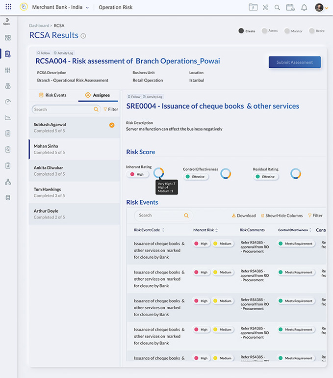
GRC Stands for Governance, Risk Management and Compliance. A GRC platform can help companies break down silos in processes and data, comply with regulations, and monitor, measure, and predict losses and risk events.
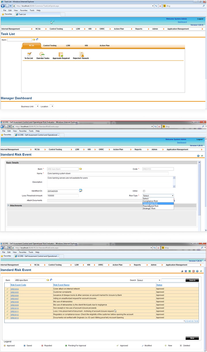
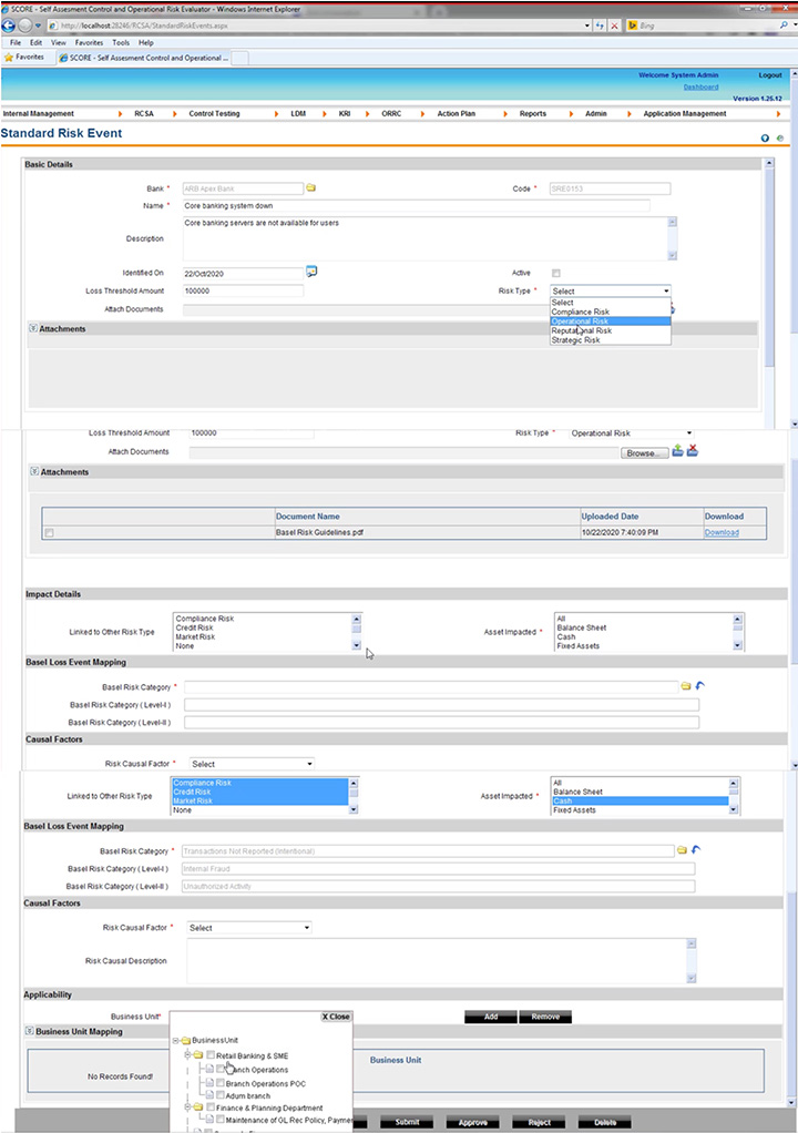
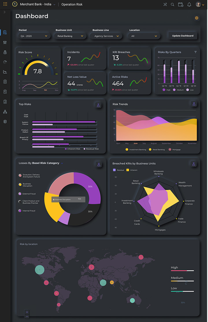
The rapidly changing regulatory landscape has increased the cost of compliance for banks & financial institutions worldwide. Most of these institutions are still clinging to rusty legacy technology because they are just “good enough” and still “work fine”. The result is suboptimal automation leading to even more manual effort and cost.
Compliance shouldn’t be this expensive and that banks & FIs should have access to new age, no code compliance platforms that automate & simplify regulatory compliance, this is where Aptivaa comes into the picture. Incubated by Aptivaa, CogNext is a next-generation regtech that allows banks and financial institutions to automate and digitize analytical processes at an enterprise scale, using artificial intelligence, seamless technology connections and deep understanding of human behavior and how they make decisions.
UX Challenge
To understand the complex domain of GRC. Each organization has a different way of handling it so we had to come up with a design that not only shows a consolidated and meaningful information without overwhelming the users, but it had to cater to a diverse range of users from managers to CROs to auditors and also accounts for the different working styles and priorities of different organizations.
Redesign Goals:
- Create best in class UX design on the Governance, Risk and Compliance Software Products.
- Make it easy and efficient to use.
- Create a rich UI that is visually appealing for the decision makers.
Our solution
Our approach for this project allowed us to understand the complex domain of governance, risk and compliance while identifying the UX issues that was causing the friction.
Methodology
Walkthrough of the current app.
Understand user behavior, user journeys with the gaps and points of friction through user research.
Design to address the gaps and friction to design an easy-to-use application.
Deliver a best-in-class and differentiated experience.
The Outcome
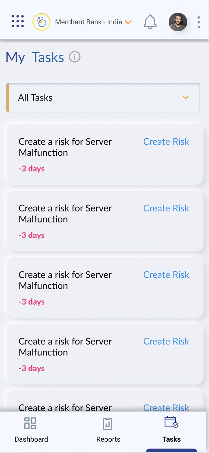
The user experience design approach essentially focused on 8 key points:
Minimal Learning Curve: Ensure to provide all the features users want while keeping an interface clean and simple.
Easy to Use: Ensure it’s not just simple to use but it’s also easy to get information from various auxiliary software and channels.
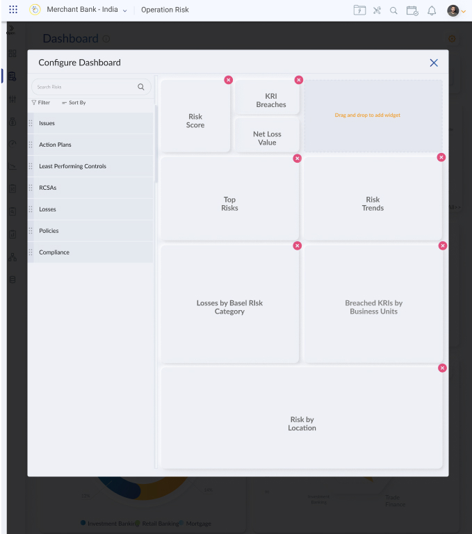
Engaging: Engage the users and encourage them to dive deep or zoom out while interacting with charts and data.
Visual: Being a data heavy domain it was paramount to hold true to the no-code platform by allowing users to show and manipulate data visually using functionalities like drag and drop and mind maps.
Customizable: Allow users to slice and dice data in a more meaningful manner based on their individual requirements.
Intelligent: Make the system smart enough to call out important alerts and provide valuable insights
Contemporary: Show boring data in a more visually appealing way and provide delight in a seemingly dull domain
Differentiated: Build something remarkable that is worth noticing. Ordinary and boring products won’t sell anymore no matter how you market them.


This application has gone live a few months back, and the results are awaited.